Before + After: Wallpaper Hack - How We Hid a Textured Wall
As short-term borrowers of our current, temporary living space (which is partially furnished and accessorized), we’re endeavoring to strike a balance between making it comfortable for our lifestyle, while also trying not to disrupt the space irreversibly. (Read more about my feelings on this balancing act via my previous post, and discover where we are and why we’re here via this entry from January.)
In our space, there’s a little nook in the multitasking nursery + playroom + bedroom, which I knew I wanted to turn into something special for our second baby, who arrives this spring. Other than the crib, this spot will be our newest family member’s only dedicated zone.
While envisioning the room makeover from across the country prior to our move, I’d pictured using a bright, playful, peel + stick wallpaper that would wrap around the full cubby, adding visual interest and depth to the otherwise static space.
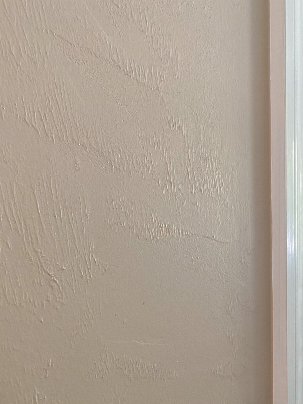
… Then I remembered that the entire room (which was built in the late 80s/early 90s) has textured walls. Naturally, wallpaper won’t successfully adhere fully to textured surfaces. And even if it did, the details of the wall would show through.
Fully resurfacing or masking the walls (like with beadboard) isn’t an option. We’re not here long enough to make the cost and footprint worth it, plus a change of that magnitude feels like a disrespectful level of change to introduce to a borrowed suite. We did, however, update the walls to Pure White, replacing the brown-beige color that was here upon our arrival. Still, the room needed something more to make it feel special, and I wasn’t willing to give up the vision for the nook.
I decided to attempt an inexpensive little hack in order to incorporate the peel + stick paper and hide the textured wall of the cut-out. We went to The Home Depot and picked out a single, thin panel of plywood that is lightweight enough to easily hang from a wall, but sturdy enough to resist major warping from humidity.
While there, we worked with an employee to cut the panel into slices sized uniquely for popping into the three divided sections of the nook. For the larger, lower slice, we used one uniform panel. For the two remaining areas, we puzzled together the plywood with neutral-toned tape (so it wouldn’t show through the wallpaper,) in order to keep the panels somewhat flexible for sliding in and out of the tightly built-in shelving. We gave up on the idea of the full wrap for the sake of our sanity, hoping that if we could pull the hack off for the back wall it would be enough to scratch the itch.
We covered the panels with a peel + stick wall mural. I chose the mural version instead of the wallpaper, as I preferred a wider spacing / larger print of the artwork for this particular project, rather than a tightly repeating pattern. I selected an orange grove design as a nod to Florida, ushering in the rich greens and playful but watered-down terracottas I’d planned to use within the room.
Thankfully, the peel + stick mural was forgiving, as Adam and I had to reset it a few times to get the layer as smooth as possible over the untreated plywood. The application took about an hour, as I’m in my 8th month of this pregnancy and my range of motion is getting more limited by the day.
To our delight, the panels popped perfectly into the cubby, and a simple screw driven into either side of each panel is enough to hold them in place.
I can’t change the carpet or the dresser, but thanks to the mural I’m no longer bothered by those features. The simple decluttering of the shelves and the addition of the bright paint and orange grove artwork were enough to make the visual and emotional impact I’d hoped.
Our 4 year old likes it, as do we. I hope his little sibling does, too. We’ll find out soon!
Sources:
Jute Baskets: Will & Atlas
Abacus: Etsy
Clothing: Primary Dot Com (Use code WHIT25 for 25% off)
Wall Mural / Paper: Society 6
Duck Baskets: Vintage via Etsy
Changing Pad: Gathre


