The Tiny Canal Cottage is a resource for helping folks mindfully conceptualize, decorate and enjoy versatile + smaller home spaces. Founded by designer, consultant, stylist, creative director and author, Whitney Leigh Morris, this family-owned small business recently finished the construction of a new, compact cottage and greenhouse-office in the southeastern US, and are also restoring a little 1800s French farmhouse and its outbuildings with co-stewards. Morris’ focus is crafting flexible, sustainable, and more community-focused home spaces. Explore Whitney’s book, blog, and social channels for years of tips and tales from living and working in — and with — a smaller footprint.
Bond Group Entertainment:
A Narrow Thoroughfare-Turned-Lobby
(Click here to return to the main post.)
The lobby of Bond Group Entertainment is a somewhat tricky space. It functions primarily as a thoroughfare, as it’s actually a wide hallway that connects all the spaces throughout the offices. But when visitors are on their way in, it becomes a lobby that faces the glass walls of the interior offices.
This means that the space needed to stay open— no coffee tables to dodge. It also means that the lobby is best visually uncluttered, because it’s the unifying thread that connects each office— and each of those offices has its own distinct style that can clearly be seen through the glass walls.
When I first surveyed the lobby and reception areas, they were outfitted with standard, modern office furniture, but not much else. The members of Bond Group requested that I keep their three white armchairs that were already in the lobby, and decorate around those. (We donated the rest of the furnishings to to L.A. Shares, which is a non-profit that distributes furnishings and goods from businesses to nonprofits and schools in need in Los Angeles.)
Despite the fact that there’s a lot to take in the moment you step into Bond Group, the eye seems to gravitate immediately towards a far wall at the end of the lobby. So I started with that wall— specifically with its art— and worked from there.
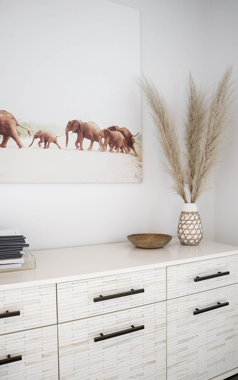
Amy and Stacy named their production company after elephant bond groups. (Herds of elephants have matriarchal heads, and commonly develop strong, life-long bonds.) In lieu placing their logo on the wall, I wanted a discrete yet direct artistic nod to the company’s namesake in this prominent spot. Conveniently, Arielle Vey— a photographer and friend of mine— had just visited Uganda and captured the most magnificent image of an elephant crossing. I asked her if she’d be willing to create a print of the piece for the office, and she kindly listed the shot, now entitled Benson, to her site. The photograph itself is truly beautiful, but it also does a fantastic job of merging the modern colors and style of the office with the warmer furnishings and accessories we used within it.
Beneath Benson I installed a wood tiled console/buffet, which is one of my favorite pieces in the space. The buffet is topped with a tray, some scripts, a vintage bowl, a vase from Anthropologie, and fluffy tufts of pampas grass.
Another stand-out in this space is the oversized Emmit Rug from Lulu and Georgia. It’s durable enough for a transitional space such as the lobby, but is still only about 1.5” in pile height, so it doesn’t catch shoes as the staff passes through the hall.
I removed the low, chunky metal accent tables between the armchairs and replaced them with taller, slim, airy pedestal stands made of marble, glass and steel. The tabletops are large enough to excuse the lack of a coffee table.
Since we kept the chairs that were already in the space, I added some texture and shine to their deep-set seats with the Espejo Pillow designed by my friend Justina Blakeney for Loloi Rugs. These throw pillows are like a bridge connecting diverse design styles. They lend a bit of a boho touch to a modern environment, while providing depth with their lil’ mirrored details.
Behind the chairs is the largest wall in the office, for which Amy requested macrame art. I found a unique piece that was crafted by local fiber artist, Melissa Flynn. She foraged the Oak branch from Topanga Canyon, and used rope, string, yarn and leather to create a delicate yet texture-rich wall hanging that looks wonderful from within the lobby, and just as appropriate when viewed from within the offices and conference room that face it. Rather than hanging it from a single loop as intended, I used two larger mirror hooks to distribute the weight and reflect some light from the exterior windows on the opposite wall.
By the lobby’s front door, I added some handcrafted, speckled stoneware hooks made by Virginia Sin. To the right, I set up a decorative yet functional wall of scripts via handcrafted leather straps.
RECEPTION
The reception nook was a somewhat tricky spot. The furnishings needed to be slim enough to allow traffic to flow in and out of the conference room, but I didn’t want the space to feel like an afterthought.
I felt as though the back wall desperately needed a mirror. Despite the ample sunlight that flows into the offices, this little corner is oddly dark, and it felt small as a result. A large, custom leaning mirror made by Croft House here in LA was the perfect solution. The Rivera Oak Mirror (in the color Bone) blends smoothly into the space, while also brightening the reception area and reflecting the entire lobby.
Erica, who uses this space the most often, requested a standing desk, so I selected a versatile white rolling counter-height table. I paired it with an adjustable drafting chair on casters that she can use at the unique height, or simply roll into the corner when she prefers to stand. A footed ceramic planter adds texture and a personal touch to her workspace.
I defined the zone with a petite area rug, and added a touch of storage via a 3-tiered rolling cart stocked with neutral-toned jute baskets from Dharma Door USA. I used a seagrass basket instead of a traditional waste bin, as well as marble office supplies to keep the tabletop looking organized and polished.
Last, we added hanging ceramic planters with trailing greenery from Rolling Greens to safely mask some of the building’s utility pipes without obstructing them.
(Portrait of Amy Adams for The Tiny Canal Cottage by Marisa Vitale)