Tiny House Tour: The West Cottage
Let’s stop and chat about interior design on Social Media for a second. After scrolling through thousands upon thousands of decor-related photos over the years, I have to take a step back and remind myself that lots of us— MOST of us— don’t have the disposable income for the major overhaul projects and dream properties like the ones we see online. (And, in addition to budget constraints, what about the renters out there who want to make interior updates, but aren’t permitted to do so? What types of creative solutions are available?) It’s easy to get sucked into feeling like life will be better when we have a new home, more money, and free rein to craft our ideal house. This is where I always pump the breaks.
I don’t want to live my life waiting for the next phase. I want to be satisfied and content in the now. And, personally, I don’t want to spend my time agonizing over items and details that pull my focus away from the things that matter most in my life— family, friends, and community.
Having said that, I obviously care about how my home looks and functions. I’ve made a career of it. But my aim is for everything to be accessible, and to create beauty, function and joy in simple ways.
When the opportunity arose to rent the front cottage on our property late last year, we jumped on it. We knew it would be the perfect place for my parents to stay when they visit LA, as well as a convenient spot for the events and creative crews that regularly set up shop here. (After all, this tiny house is a twin to our own, and sits just 8’ away from ours.) But the house needed some love— certain elements were rotting away, and others were simply, well, not our style But as renters on a very tight budget, we had to pick-and-choose what to tackle, and what to accept. We took our time, weighing out everything we wanted to do, versus everything we felt like we needed to do. Here’s how it turned out
LIVING ROOM
WHAT WE DID:
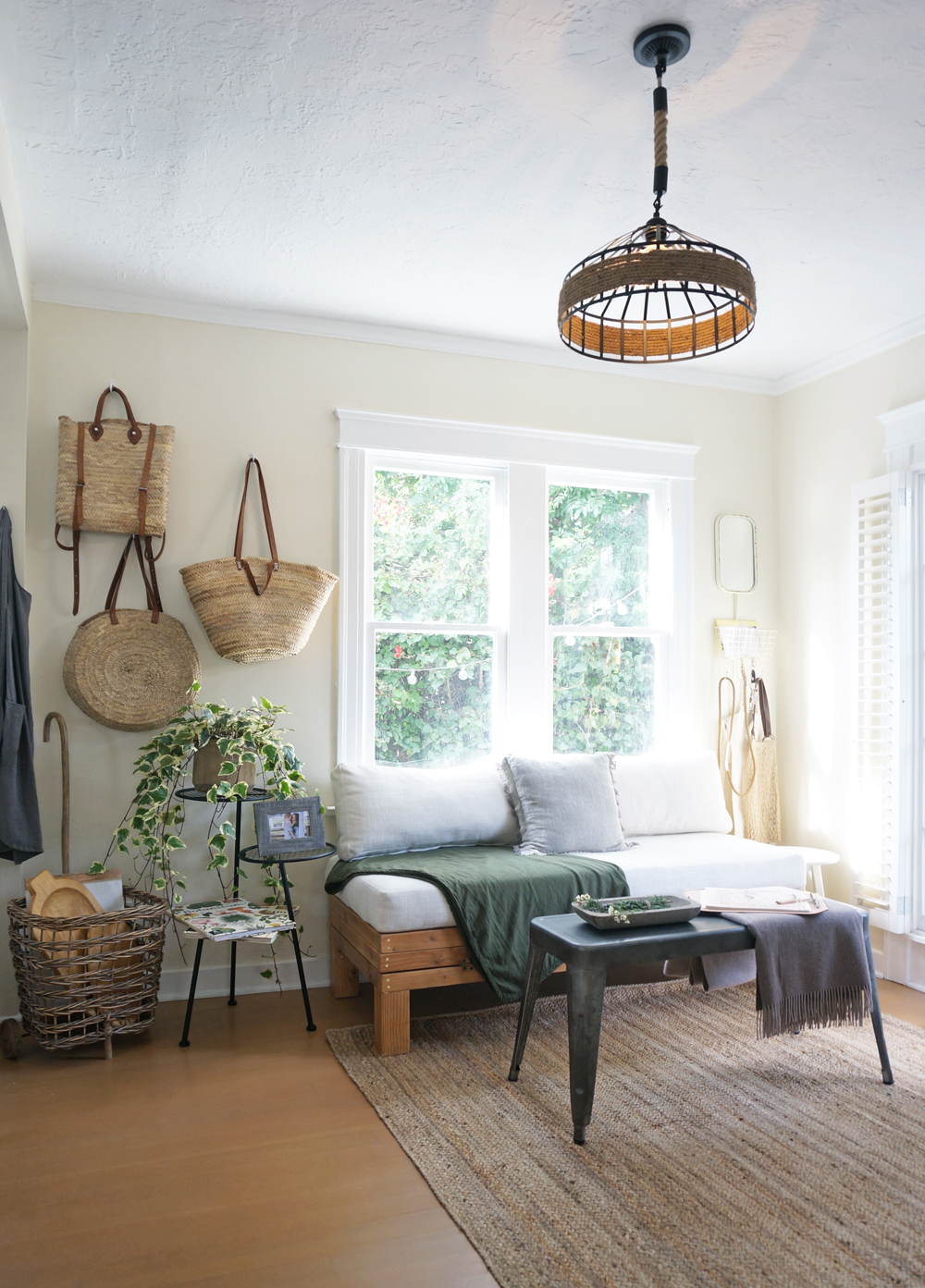
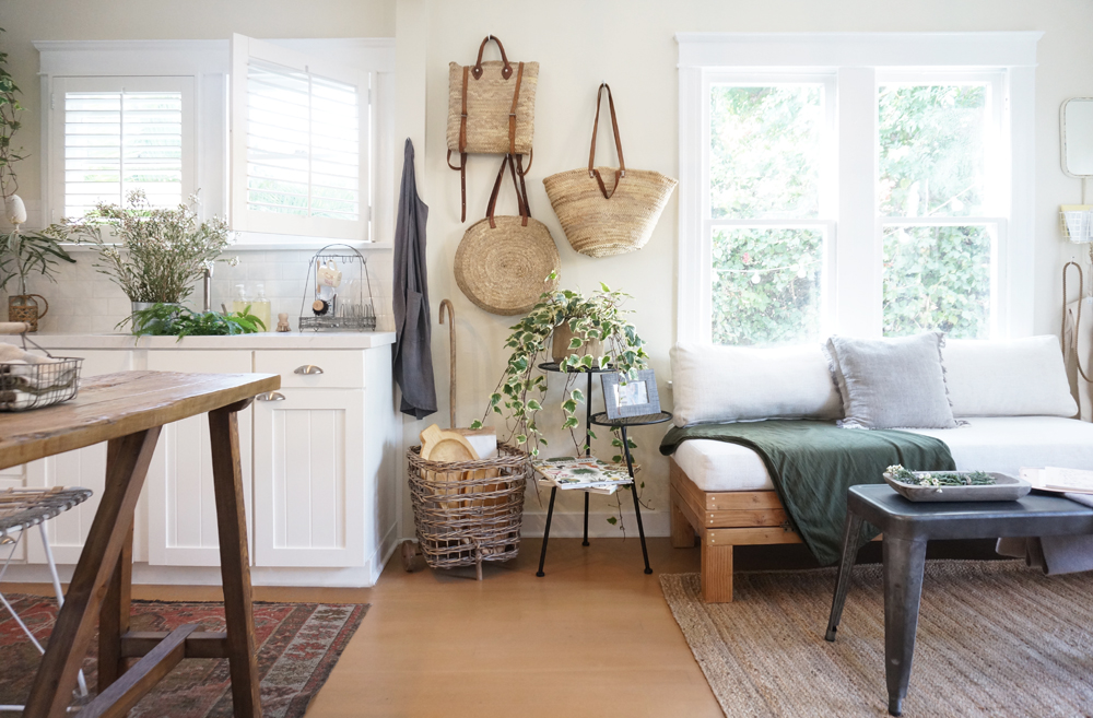
Just like the main room of The Tiny Canal Cottage, this room is TINY. We knew that we needed the ability to fit a queen-sized bed in here, but the solution wasn’t going to be a quick fix. Inflatable beds are fine, but I wanted to offer my parents something a bit sturdier and more suitable to their needs. A typical pull-out or fold-down sleeper couch wasn’t an option either. Besides getting lumpy and warped, they also tend to take up a lot of room on the back side, and we couldn’t spare those precious inches. Plus I did’t want to block the living room windows, yet I knew the couch would be best situated in front of them.
Our solution was a custom accordion fold-out bench by Tumbleweed & Dandelion here in Venice, CA. The bench is a perfect height for our (very) tall family when in couch-mode, and the cushions are comfortable without being too bulky to stash when the bench is extended. To adapt the piece into a queen bed, we simply fold it out and twist on its wooden legs (which we keep stashed in a a wine crate on the nearby built-in bookshelf, where the spare linens are also kept). We can use a traditional or inflatable mattress. The conversion process takes about 5 minutes. As long as we scoot the bed over by a few feet, the front door can still open completely.
I also scrapped traditional window treatments on the living room windows. When we have overnight guests, a simple tension rod is added to the top of each window, and I suspend the same curtain panels that we once used in West’s nursery nook when he was a newborn.
WHAT WE SKIPPED:
We would’ve loved to remove the front door, widen the doorframe, and create custom French doors (like the ones in our “main” cottage), but that was beyond our budget as renters.
Similarly, we would’ve liked to remove the custom plantation shutters on the door and neighboring windows. They look pretty, but they’re horribly impractical in a small space. However, the interiors of the window frames would've had to be sanded, refinished and repainted, and we chose to reallocate that amount of money into savings for our son.
OFFICE
WHAT WE DID:
There was a giant built-in desk in the living room. I found it to be depressing (it faced the wall, and was partially enclosed on the sides), and outdated— it included a keyboard pull-out tray, which prevented many types of office chairs from being able to slide under the desk. I decided that with all the other surfaces available on the property, we didn’t need another work surface. So I ripped out the desk and replaced it with two high-backed chairs, which instantly enlarged the room, and made it into the perfect spot for reading, chatting, and relaxing.
We also removed the standard interior door that divided the office from the bedroom, and replaced it with a space-saving bifold door. We painted it white and finished it with a custom knob, and it's one of the best changed we made to the house. The accordion design saves so much room when the door is left open, and the frosted, tempered glass provides ample privacy, while still permitting soft light to flow through.
WHAT WE SKIPPED:
I was also interested in removing the built-in bookshelves, as we didn’t need all that extra storage space. A big mirror in its place would’ve opened up the room, and reflected the bougainvillea, sunlight, and cafe lights from the windows on the opposite wall. But the bookshelves are in great condition, and proved to be useful when paired with book baskets and wine crates that hold the spare linens, so we kept them.
KITCHEN
WHAT WE DID:
Our biggest investment was the kitchen… which is a bit ridiculous because (between both of our tiny houses,) we now have TWO kitchens in under 800 square feet. But we knew that these relatively small adjustments would completely transform the tiny house, which they did.
We removed the builder-grade wall cabinets, swapping them out for two open shelves, handmade from reclaimed wood. We also removed the 30” range hood, which hung over a 24” range and overpowered the space. We replaced the oven with a model that actually fit the space allocated for it. In doing so, we eliminated the sliver of space where the narrow trash can stood, so we decided to build a pull-out can into the base cabinets.
We installed exposed shelving by Tumbleweed & Dandelion. We added a pull-out trash drawer, a new sink and faucet, and new countertops from Cambria, installed by Giallo Stone. We recycled and adjusted the old wall cabinets doors for the updated base cabinets. An upcycled console table, counter stools, and vintage rug from New England Loom round off the kitchen.
The base cabinets and counter had an unnecessary 90-degree corner at the end, which partially-enclosed the kitchen, and made it feel cramped. Because of that corner, the sink wasn’t aligned with the windows above it. (The sink was horrible anyway— you could pop it out with a pencil.) We removed the 90-degree corner, and installed the pull-out trash and recycling in its place. We upgraded the sink to a larger Kohler, and added a pull-out Purist pull-out faucet. Then we repurposed and modified the old wall cabinet hardware and doors on the newly modified base cabinets. We topped everything off with a beautiful, milky matte slab of Weybourne from Cambria, which made the space feel polished and clean, without appearing too sterile.
We updated the lighting, and swapped out the butcher-block pub table and standard stools for a console table made from upcycled floor boards. We added two high-backed counter stools with an open-weave design, which keeps the space feeling airy and uncluttered. Lastly, we unified and defined the kitchen by adding a multi-color vintage runner rug from New England Loom
WHAT WE SKIPPED:
I would’ve very much liked to replace the base cabinets and the white subway tiles in the kitchen to give the room more personality. But both are in fine condition and function as needed, so we opted to save the money and headache and accept the kitchen without those upgrades. Despite the standard tiles and cabinets, we now love the room, which has so much more texture and depth than it did before.
BEDROOM
WHAT WE DID:
We turned the bedroom of the front cottage into West’s play space. We mainly made repairs in here, focusing on keeping it clean and safe for our toddler. We repaired the windows that were in horrible condition, and we patched and painted the walls, which were cracked, chipped and full of holes (some tiny, some several inches wide) after years of neglect.
We did make one hugely helpful design change: the doors. In this small room, which measures about 8’ x 10’, there were FOUR DOORS. (Why?!) The porch and closet doors would crash into each other when opened, much like the bathroom and living room doors did on the opposite side. One door from each corner was going to have to go.
We found a wonderful wood and frosted, tempered glass bi-fold door for the doorway between the bedroom and living room. Then we removed the closet door entirely and commissioned a gorgeous hand-made curtain from Luna Zorro to suspend in the frame. We couldn’t have used sliding barn doors, as we didn’t have the available wall space for those. And pocket doors require construction and are thus far more expensive. The bi-fold door and curtain were simple, fast, and affordable solutions that instantly made a huge difference in the appearance and functionality of the entire house.
West's closet and porch doors used to crash open into one another, so we swapped the closet door out for a custom, handmade curtain from Luna Zorro. We added rattan mirrors on the little wall between the closet and the bathroom to reflect sunlight, and we set up a little diaper changing storage station via a low, windowed hutch.
Our son still co-sleeps with us at night, but he now naps, reads, and snuggles with the pups in his amazing new convertible crib / toddler bed / daybed. (The items on the shelf above are anchored with earthquake putty.)
WHAT WE SKIPPED:
West has a tiny bathroom and (an empty) closet off his room that function perfectly well, but aren’t beautiful or interesting. As renters, we decided to skip construction, but freshen up the bath as best we could. A vintage rug, a linen shower curtain, hanging baskets, and cascading plants livened up the room without impacting our wallets.
Disclaimer: I received select products of my selection in exchange for inclusion in the front cottage makeover and subsequent coverage. All words and opinions are my own.


